CSS Website Layout

CSS Website Layout
A CSS Website Layout defines how different sections of a website are arranged on the page—such as header, navigation, content, sidebar, and footer.
Good layouts are:
Responsive
Clean
Accessible
Easy to maintain
What is a Website Layout?
A website layout is the structural framework of a webpage that decides:
Where content appears
How sections are aligned
How the site adapts to screen sizes
Layout = Structure, not colors or fonts.
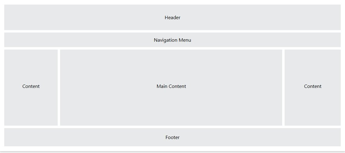
Common Website Layout Sections
Most websites contain:
Header → Logo, title
Navigation → Menu
Main Content → Page data
Sidebar → Extra info
Footer → Copyright, links
Basic Layout Using HTML + CSS
HTML Structure
CSS
- Simple
- Flexible
- Interview-friendly
Layout Using CSS Flexbox (Most Used)
Why Flexbox?
One-dimensional layout (row OR column)
Easy alignment
Responsive by default
Best for:
Navbar
Sidebar layouts
Cards
Layout Using CSS Grid (Modern & Powerful)
Why Grid?
Two-dimensional layout (rows + columns)
Perfect for full page layouts
- Clean
- Professional
- Highly recommended
Responsive Website Layout (Very Important)
Media Query Example
On mobile:
Sidebar goes below content
Layout becomes vertical
Fixed vs Fluid Layout
| Type | Description |
|---|---|
| Fixed | Width in px (not responsive) |
| Fluid | Width in % |
| Responsive | Uses media queries |
Responsive layouts are best practice
Centering Layout (Classic Problem)
- Horizontally centered
- Widely used
Common Layout Mistakes
- Using tables for layout
- Fixed widths everywhere
- No mobile support
- Overusing floats
- Ignoring accessibility
Website Layout Interview Questions
Q1. Best layout method today?
Ans. CSS Grid + Flexbox
Q2. Difference between Grid and Flexbox?
Ans. Grid = 2D, Flexbox = 1D
Q3. What makes a layout responsive?
Ans. Media queries + flexible units
Q4. Should tables be used for layout?
Ans. No
Real-Life Use Cases
- Business websites
- Blogs & CMS (WordPress)
- Dashboards
- E-commerce sites
- Portfolio websites
Summary
CSS layout controls page structure
Use Flexbox for components
Use Grid for full-page layouts
Always make layouts responsive
Avoid tables & fixed-only designs
Essential topic for web interviews
