HTML Responsive Web Design

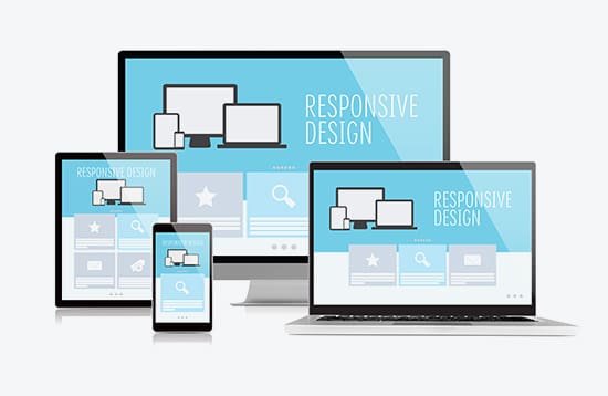
HTML Responsive Web Design (RWD)
Responsive Web Design (RWD) means designing websites that automatically adapt to different screen sizes—mobile, tablet, laptop, desktop—without breaking layout or usability.
1. Why Responsive Design Is Important
Mobile-first world (most users are on phones)
Better SEO (Google prefers responsive sites)
Improved user experience
One site for all devices (no separate mobile site)
2. Core Principles of Responsive Design
Fluid Layouts
Use relative units instead of fixed pixels.
Flexible Images
Images should scale with screen size.
Media Queries
Apply CSS based on screen width.
3. The Viewport Meta Tag (Mandatory)
Without this, mobile browsers won’t scale correctly.
Always place it inside <head>.
4. Responsive Layout with Flexbox
- Side-by-side on desktop
- Stacked on mobile
5. Responsive Layout with CSS Grid
- Perfect for full-page layouts
- Clean and powerful
6. Common Breakpoints (Guideline)
| Device | Width |
|---|---|
| Mobile | ≤ 600px |
| Tablet | 601px – 992px |
| Desktop | ≥ 993px |
7. Mobile-First Approach (Best Practice)
Start with mobile styles, then enhance for larger screens.
- Faster loading
- Cleaner CSS
- Better UX
8. Responsive Typography
- Text scales smoothly across devices
9. Testing Responsive Design
Browser DevTools (Toggle device toolbar)
Real mobile devices
Resize browser window
Common Mistakes
- Fixed widths (
width: 1200px) - Missing viewport meta tag
- Too many breakpoints
- Not testing on mobile
Key Takeaways
Responsive design adapts to all screens
Use viewport, media queries, flex/grid
Prefer mobile-first
Flexible images & typography matter
Essential for SEO & UX