R Line Plot
📈 R Line Plot (Beginner → Practical)
A line plot in R is used to visualize data trends over time or ordered values.
It’s commonly used in statistics, data analysis, economics, and research.
1️⃣ What is a Line Plot in R?
A line plot connects data points with straight lines to show change or trend.
Typical uses:
Time-series data
Growth/decline trends
Comparisons over sequence
2️⃣ Basic Line Plot Syntax ⭐
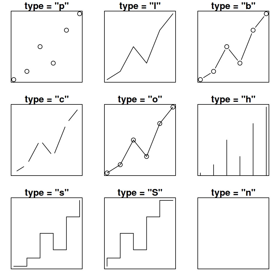
x→ x-axis valuesy→ y-axis valuestype = "l"→ line plot (l= line)
3️⃣ Simple Line Plot Example
✔ Shows a basic increasing trend
4️⃣ Line Plot with Points + Line ⭐
type = "o"→ overplotted (line + points)pch→ point symbol
5️⃣ Change Line Color, Width & Style 🎨
| Parameter | Meaning |
|---|---|
col | Line color |
lwd | Line width |
lty | Line type (1–6) |
6️⃣ Line Plot for Time Series Data ⏳
✔ Used for business & analytics
7️⃣ Multiple Lines in One Plot ⭐⭐
✔ Very common in comparisons
8️⃣ Line Plot Using ggplot2 (Modern Way) ⭐⭐⭐
✔ Cleaner
✔ Professional look
✔ Widely used in data science
9️⃣ Common Mistakes ❌
❌ Forgetting type = "l"
❌ Mismatched x and y lengths
❌ No axis labels
❌ Overcrowded multiple lines
📌 Interview / Exam Questions
What does
type = "l"mean in R?Difference between
type = "l"andtype = "o"?How to draw multiple lines in one plot?
Base R plot vs
ggplot2?How to customize line width and color?
✅ Summary
✔ Line plot shows trends over ordered data
✔ plot() is used in base R
✔ type = "l" creates a line plot
✔ lines() adds more lines
✔ ggplot2 is preferred for advanced visuals
✔ Very important for data analysis & exams


