R Scatter Plot
📊 R Scatter Plot
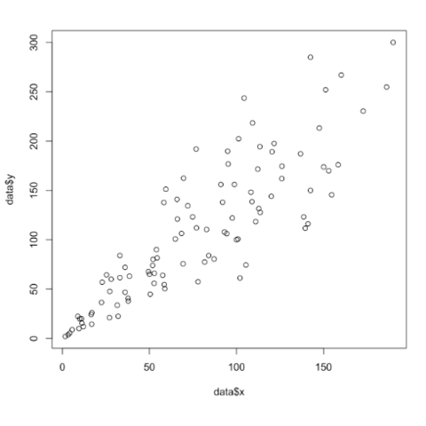
Each point represents one observation, making it ideal for correlation and trend analysis.
1. Basic Scatter Plot
Use the plot() function (default is scatter plot).
2. Scatter Plot with Title & Labels
3. Change Point Color & Shape
📌
col→ colorpch→ point shape
4. Change Point Size
5. Add a Trend Line
✔ Shows linear relationship
6. Multiple Scatter Plots
7. Scatter Plot Using Data Frame
8. Add Grid
9. Pairwise Scatter Plot
✔ Shows scatter plots between all numeric columns
📌 Summary
Scatter plots show relationships
Default plot type in R
Highly customizable
Trend lines help analyze correlation